Blogs
The Psychology of Color in Interior Design: What Works for Offices?
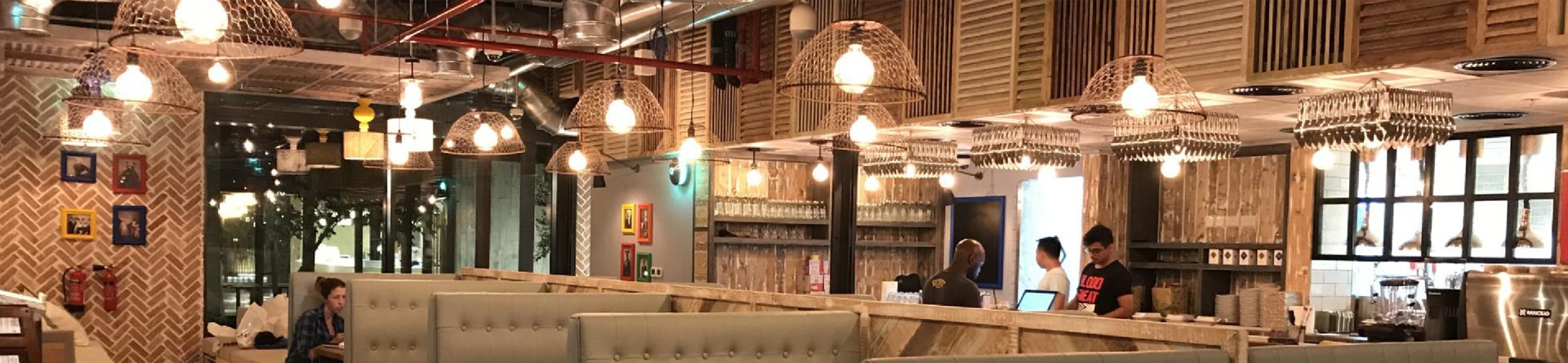
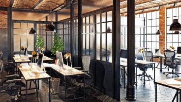
Color does more than fill a room—it shapes how people feel, think, and work. In an office, the right colors can calm the mind, lift energy, spark ideas, or support focus.
Recent workplace studies show that small design choices like wall color or lighting, can make a real difference in how comfortable and focused people feel during the day. So, if you're setting up a new office or thinking about updating your current space, understanding color psychology in office design can make a big difference.
Let’s look at how different colors work in office spaces and how you can use them to create a better place to work.
1. Blue – Helps People Focus and Stay Calm
Blue is a great pick for areas that need calm and focus. It helps people think clearly and feel steady, especially during long work hours. That’s why it’s often seen in offices that handle numbers, plans, or private discussions.
Blue is one of the best colors for office productivity, especially when paired with simple layouts and good lighting.
2. Green – Brings Balance and Reduces Eye Strain
Green feels peaceful and reminds us of nature. In busy spaces or open offices, green can help people stay balanced and fresh throughout the day.
This color is often part of office color schemes and mood settings for open work zones, lounge areas, or shared spaces.
You don’t need a full green wall—just some plants, art, or chairs in green can make a big difference.
3. Yellow – Sparks Creativity and Lifts Mood
Yellow brings energy. It works well in places where people need to think differently or come up with new ideas. It’s warm, cheerful, and a bit playful—but it can feel loud if overdone.
It’s best used as an accent—in a meeting pod, on a chair, or in artwork.
Designers often use yellow when following interior design tips for offices that aim to brighten up the mood or support team creativity.
4. Red – Bold
Red grabs attention. It adds excitement and can make people feel more alert. But too much red in a room can feel heavy or stressful.
A little red can go a long way—try it in social areas, quick meeting corners, or team zones with fast-moving tasks.
It’s closely tied to how color affects workplace behavior, especially in high-pressure or high-energy workspaces.
5. Neutral Colors – Keep Things Calm and Professional
Whites, greys, and soft beiges are the quiet heroes of office design. They help make the room feel open and tidy. These colors also help other shades stand out.
Use them in reception areas, boardrooms, or any space where you want a calm, professional feel.
They’re easy to pair with everything—from bright colors to natural wood or metal finishes.
Choosing the Right Mix of Colors
Before you choose your palette, ask:
- What happens in this space every day?
- Who uses it—and what helps them feel good at work?
- How can the colors reflect your company’s values or style?
This helps you apply interior design tips for offices in a way that’s both smart and functional.
Need Help Designing Your Office?
At CSI, we design office spaces that feel good to walk into and better to work in. Our team helps businesses pick the right layout, materials, and yes, the right colors—so every part of the space works with your people, not against them.
Final Words
Color sets the tone. It helps people feel calm, focused, creative, or all three. With the right mix, your office can do more than look nice.
Need a smarter workspace? Talk to CSI to explore expert fit-out and design solutions.
Interior Fit Out Contractors in Dubai
Do you want us to get back to you?
Feel free to call us on +971 4 262 5261 or send an email to info@csiuae.ae and our sales consultant will get back to you.
Get in TouchInterior Design Consultants in Dubai
Interior Design Company in Dubai